Squint Test at One in the Morning: The UK Casino Lobbies That Crumble in the Dark

Photo: Rawpixel.com, CC0, via Wikimedia Commons
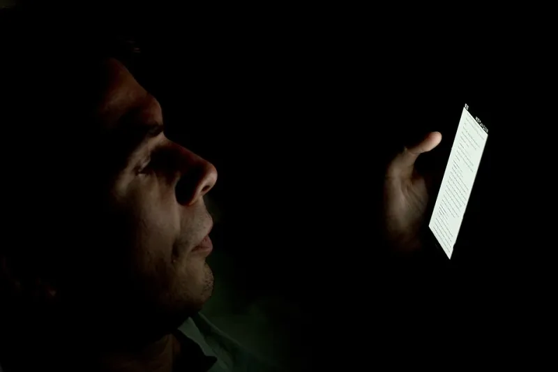
It's gone one in the morning. The other half is asleep, the lamp is off, and you've got your phone at minimum brightness under the duvet like a teenager in 2009. You open a casino site to have a few spins — and get hit square in the retina with a wall of white so bright you could signal ships.
We've all been there. So we decided to make it official. Over one bleary week, three of us tested ten UK-licensed casino sites and apps in genuine darkness: lights off, screen brightness at its lowest, the way real night owls actually play. We scored each site on five things — lobby glare, dark mode availability, contrast of text, button visibility, and the readability of the small print when your eyes are already shot.
The results ranged from genuinely thoughtful to outright hostile.
The Method (Such As It Was)
No lab coats here. Just three tired testers, three phones of varying vintage, and a shared Google Sheet titled 'ow, my eyes'. Each site got played for at least twenty minutes in full darkness — enough time to load a few slots, poke at the bonus terms, and attempt a deposit without waking anyone up.
We scored out of ten per category. Arguments were had. Tea was consumed. One tester fell asleep mid-review of a fishing slot, which we've chosen to count as data.
The Offenders: Lobbies Lit Like a Supermarket
A handful of sites haven't grasped that not everyone plays at noon with the curtains open. The worst offenders served up pure white backgrounds with neon orange buttons — a combination that at 1am feels less like entertainment and more like an eye exam you didn't sign up for.
One particularly popular brand shall remain nameless, but its bonus terms page was set in what we can only describe as 'ants font' — grey text on white, roughly 9pt, requiring pinch-to-zoom gymnastics just to check the wagering requirements. If a site makes it that hard to read how many times you need to roll over a bonus in the dark, that's not an accident. That's design working exactly as intended.
Another site hid its game categories in low-contrast grey-on-grey, meaning that bleary-eyed, we kept tapping the promotions banner instead. Whether that's a bug or a business model, we'll let you decide.
The Middle of the Pack: Fine, But Forget It
Most sites landed somewhere in the middle. They offer a dark-ish theme — usually a dark navy rather than true black — which helps, but then undo all that goodwill with bright white pop-ups for deposit bonuses that detonate like a flashbang the moment you log in.
The tell-tale sign of a middling site: the lobby looks lovely in the dark, but the moment you open the banking page or the responsible gambling tools, you're back in Blinding White Document Land. It's as if someone built a night-friendly casino and then forgot to tell the payments team.
The Genuinely Good Ones
A couple of sites clearly have someone on the design team who plays in bed with the lights off, because it shows. True dark mode — proper near-black backgrounds, not just dark blue — with warm accent colours that don't sear. Text at readable sizes. Buttons big enough to hit with a tired thumb and a duvet involved.
The best of the bunch even carried the dark theme through the entire journey: lobby, game pages, the cashier, the bonus terms, all of it. One site's terms were genuinely legible at 1am without zooming, which after a week of squinting felt like a small miracle. Whoever wrote that CSS deserves a raise and possibly a nap.
Slot thumbnails matter too. On the good sites, game tiles are dimmed slightly until you hover or tap, so a wall of forty screaming game covers doesn't hit you all at once. On the bad ones, every thumbnail is a beacon.
Why This Actually Matters
You might think this is all a bit precious. But if you're playing late at night — and if you're reading this site, you probably are — screen glare in a dark room genuinely contributes to eye strain and disrupted sleep. A casino that respects that is a casino that's thought about who its players actually are.
There's a fairness angle too. Bonus terms shouldn't require daylight and a magnifying glass to read. If a site's small print is only comfortable in a well-lit office, that tells you something about how much they want you reading it.
The Verdict
If you're a committed night owl, prioritise sites with true dark mode that runs the whole way through — cashier and terms included. Check the small print size before you claim anything. And if a white pop-up blinds you on login, that's your cue to look elsewhere.
Your eyes do enough heavy lifting at 1am. The site you choose shouldn't make it worse. Play the ones that keep the lights down low — you'll thank yourself at sunrise.